

The main goal was to design an English vocabulary learning app that felt less like homework and more like a game. The challenge was to create a system that not only helps users retain new words but also keeps them motivated over time. This meant integrating a reward system, competitive features like duels, and a clean, intuitive UI that works well for both casual learners and highly engaged users.
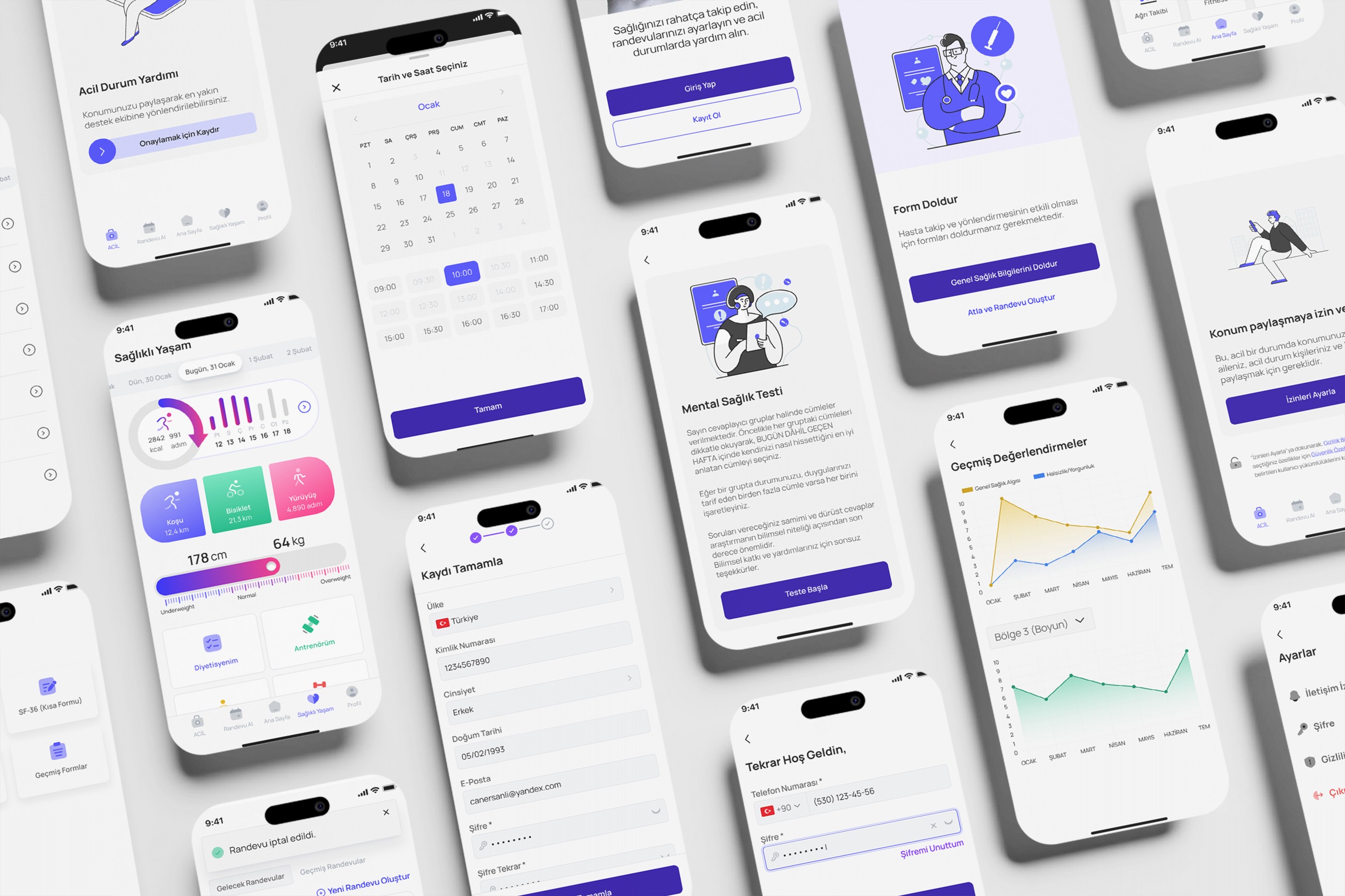
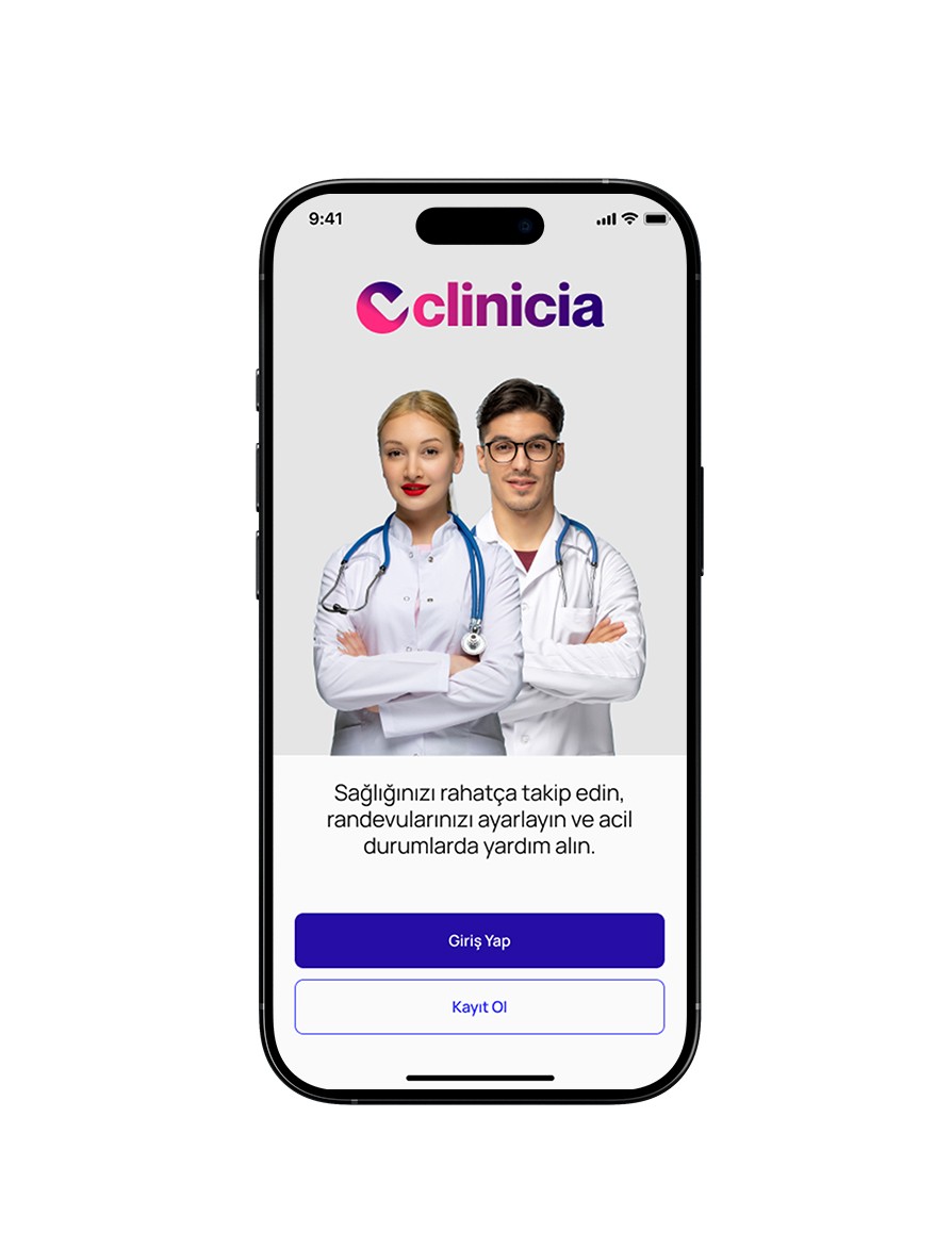
• Onboarding: I created a short, focused onboarding experience that highlights the app’s value, ease of use, appointment access, and personalized care.
• Login & Register: The authentication flows were redesigned for clarity and accessibility, with streamlined fields, supportive microcopy, and fallback options.
• Visual Language: A clean, soft UI was used with rounded elements and calm colors to evoke trust and ease. Icons and typography were chosen for readability and friendliness across all ages.
The existing onboarding and authentication flows felt outdated and unintuitive, especially for users unfamiliar with digital health platforms. Long forms, unclear instructions, and a lack of visual hierarchy caused confusion and drop-offs—critical issues in a product where trust and clarity are non-negotiable.
I redesigned the onboarding, login, and registration flows with a focus on simplicity, guidance, and emotional clarity. By reducing cognitive load, introducing supportive microcopy, and applying a soft, friendly visual style, the new experience helps users feel welcomed and in control from the very first interaction.
The redesign process focused on transforming a dense, outdated interface into a smooth, welcoming experience. Starting with user flow analysis and pain point mapping, I restructured the onboarding, login, and registration screens to reduce friction and build trust from the first tap. Every decision—from spacing to typography—was made to improve usability in a healthcare context, where ease of use and emotional clarity are critical.
• UX Improvements: I restructured the flows to minimize cognitive load and reduced unnecessary steps. Clear progress indicators and contextual guidance were added to help users feel confident during the process. Error handling and fallback scenarios were also addressed to reduce drop-off.
• UI Enhancements: I introduced a cleaner visual hierarchy, more breathable layouts, and consistent spacing to improve readability. Soft colors, rounded elements, and supportive illustrations were used to evoke a sense of trust and calm—critical in a healthcare setting.

• Replaced unclear background visuals with focused, relevant imagery to reduce distraction
• Improved text hierarchy by increasing font size and rewriting descriptions for better clarity and tone
• Updated button styles to remove outdated gradients, clarified primary/secondary actions, and adjusted sizing to meet accessibility guidelines (48x48px touch area minimum)


• Added a back button to improve navigation flexibility—users arriving from onboarding can now easily return without friction.
• Replaced inline placeholder labels with floating or top-aligned form labels to prevent confusion and improve form clarity.
• Repositioned “Forgot Password” and “Get Password” buttons closer to the relevant input field, ensuring contextual alignment and reducing cognitive load.

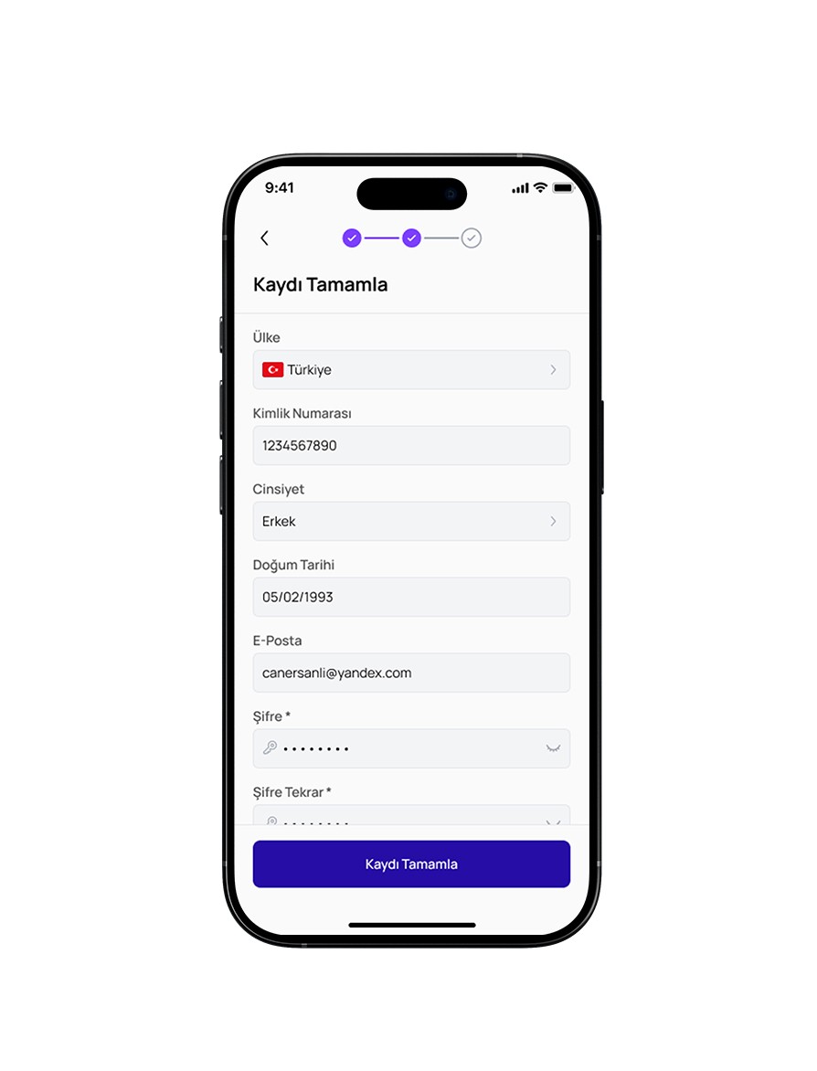
• Streamlined the registration flow by collecting the phone number only once, during the first step, and removing redundant input fields in the following stages.
• Added a verification screen directly after phone input, clearly indicating that a code would be sent—eliminating confusion and improving trust.
• Introduced a progress bar to visually guide users through the multi-step sign-up process. This helped users understand how many steps remained and increased motivation to complete registration.
• By reducing visual clutter and introducing clearer hierarchy, users were able to focus more easily and move through steps with confidence.
• Progressive form structuring and real-time validation helped prevent errors early, reducing frustration and increasing form completion rates.
• The addition of a progress indicator and supportive microcopy made the process feel more predictable, motivating users to complete it.
• Alternative CTAs and flexible pathways lowered cognitive pressure, offering users more control over their journey. Overall, the redesign led to a smoother, more accessible, and user-friendly experience—particularly important in a healthcare context where clarity and comfort are essential.